About the game
Ever wish you could pause the battles of your RPG campaign to flirt with the rogue or charm the wizard? In Dating & Dragons – A Love Quest, romance is the ultimate adventure!
Scope
This Deep Dive goes into two parts of the game: The first is all about Feat Cards, which are part of the game’s UI, and in the second part, presenting characters on the game’s website.
Designing Feat Cards
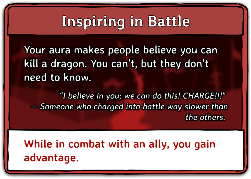
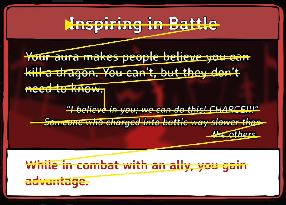
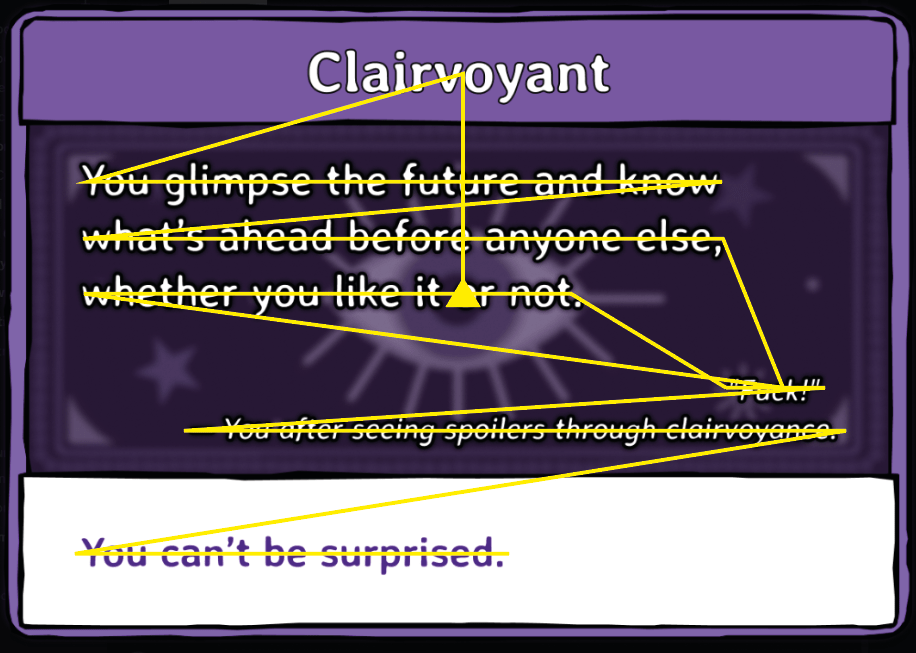
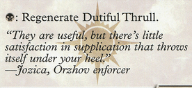
These cards are part of the game’s UI and give a choice to the player to make.
They consist of a name, a flavour text, a hook to the general story as well as an explanation of the feat itself.
The general look and feel of the cards was already quite solid, but could be polished up by adhering to some general design principles.
Goal
These cards are a core element of the game and need to not only convey a bit of the story, but also make mechanics of the game easily visible and recognizable.
The visual structure of Information
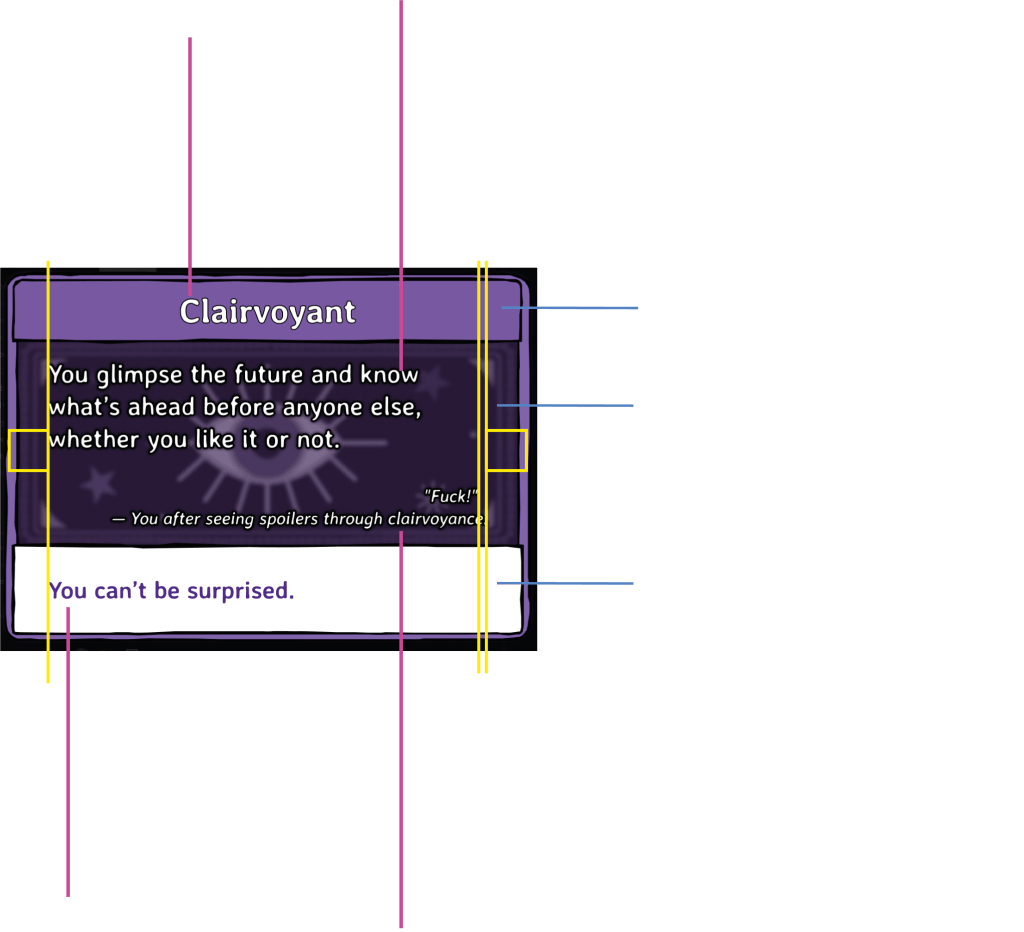
I liked the idea behind the design: the headline, the explainer box with a themed background, and the technical text illustrating what it does. The UI creator had some solid ideas; however, from a usability and design standpoint, the elements felt somewhat scattered.
Based on hierarchy, structure and colour contrasts, player would tend to move through each card in a somewhat scattered manner.
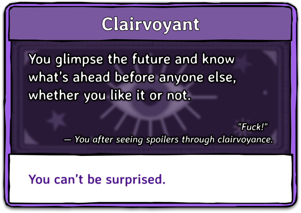
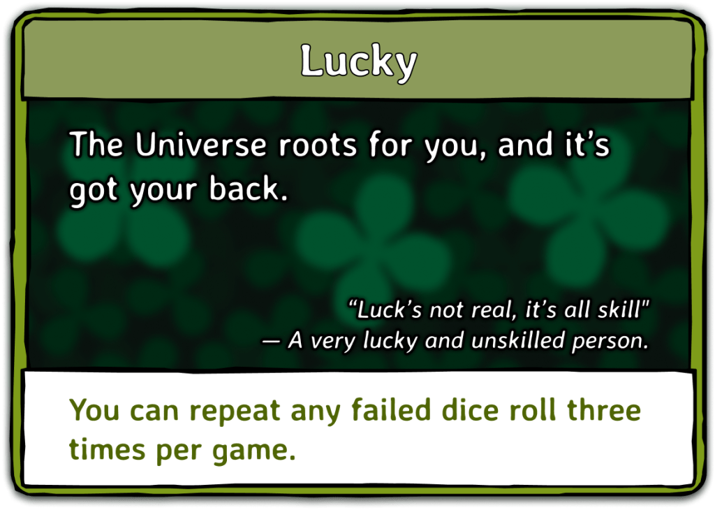
For example, for the green card, they would start in the center, drawn by the eye-catching design, then move on to the title and the left-aligned first paragraph. However, because the subsequent section is right-aligned, with line lengths that vary considerably, it is easy to get lost in the contents and structure. Finally, players would have to jump all the way back to the left edge to continue reading what the card actually does.
If I do not have access to the fonts and actual graphics used in the game, I will typically try to find close-enough variants that will still showcase the reasons and results I am going for.
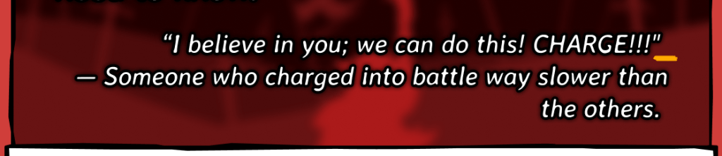
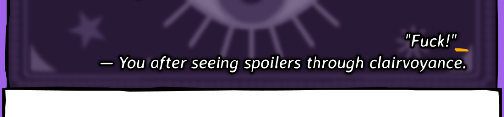
Additionally – and this can be tricky when working with multiple resolutions – it is generally a good thing to look out for lost words. You can see them in the flavour text of the red card: They are one or two stray words below a longer line. Breaking those up manually will make it visually more appealing and readable, can be hard to achieve with localized content and resolutions, though.
Spare spaces at the end or start of lines can also result in a less polished look.
Structuring information
Finding a way to structure information on cards is an important part of this UI’s design, and it is very easy to get carried away with all the options available to us.
On each card was a mix of fonts, font styles, outlines and colors. Some fonts were actually the same, but due to the effects applied had a vastly different look to them.
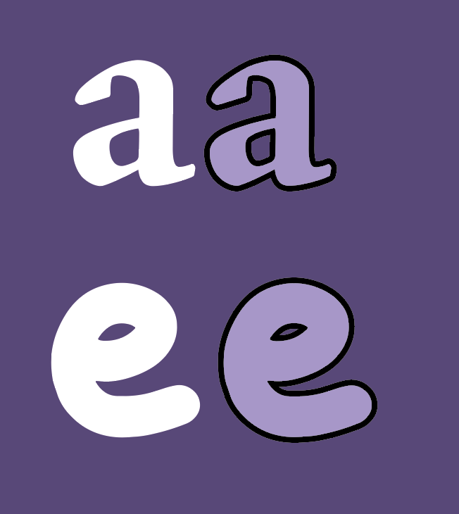
One of the very first things I will point out in any UI is the use of outlined or heavily shadowed text. Whenever an outline is applied to text, it closes up the small gaps and holes in the letters—gaps that are crucial for us to recognize and read them quickly. Sure, it can make individual letters pop more, but overall readability often suffers.
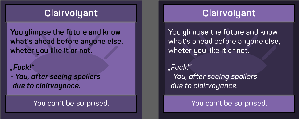
Using a flat color contrast without any effects typically makes typography much easier to read.

Color Contrasts
Another thing to point out is the contrasts between the text in the middle box and its background images. While the images provide a great eyecatcher and theming, the bright parts of the images take away the player’s focus from the text on top.
For elements like these, it is a great idea to look at how other games have solved this in the past. One game I recommend for this is Magic the Gathering by Wizards of the Coast. It’s a trading card game that needs to rely a lot of different kinds of informations in a very small space as well. Affiliation to certain factions of a card is part of its design, just like the busy backgrounds of these cards are.
Recap of proposed changes
- Remove outlines, especially around the smaller text—those outlines tend to close up letters and make them harder to read.
- Use a subtler background for the card’s text box, so it doesn’t overwhelm the content.
- Align elements so they form clear, readable groups of information.
- Reduce the variety of fonts, font sizes, and styles, keeping everything more consistent.
- Match the lower text box color to the top headline box, so the two sections feel connected and don’t constantly draw the eye away from the main content.
This is what the reworked designs looked like, it is a mix of their original design and things I pointed out. One thing that is important to me is that you are not just sticking to my notes, but will make decisions based on it that you want to implement inside your game. You have to enjoy your own project, after all.
Presenting Characters - Shape language
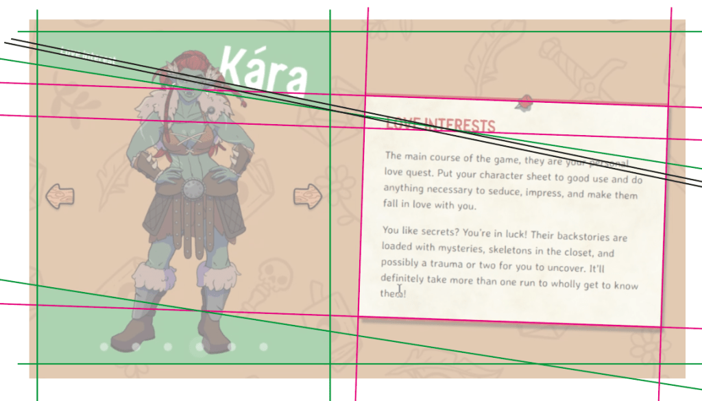
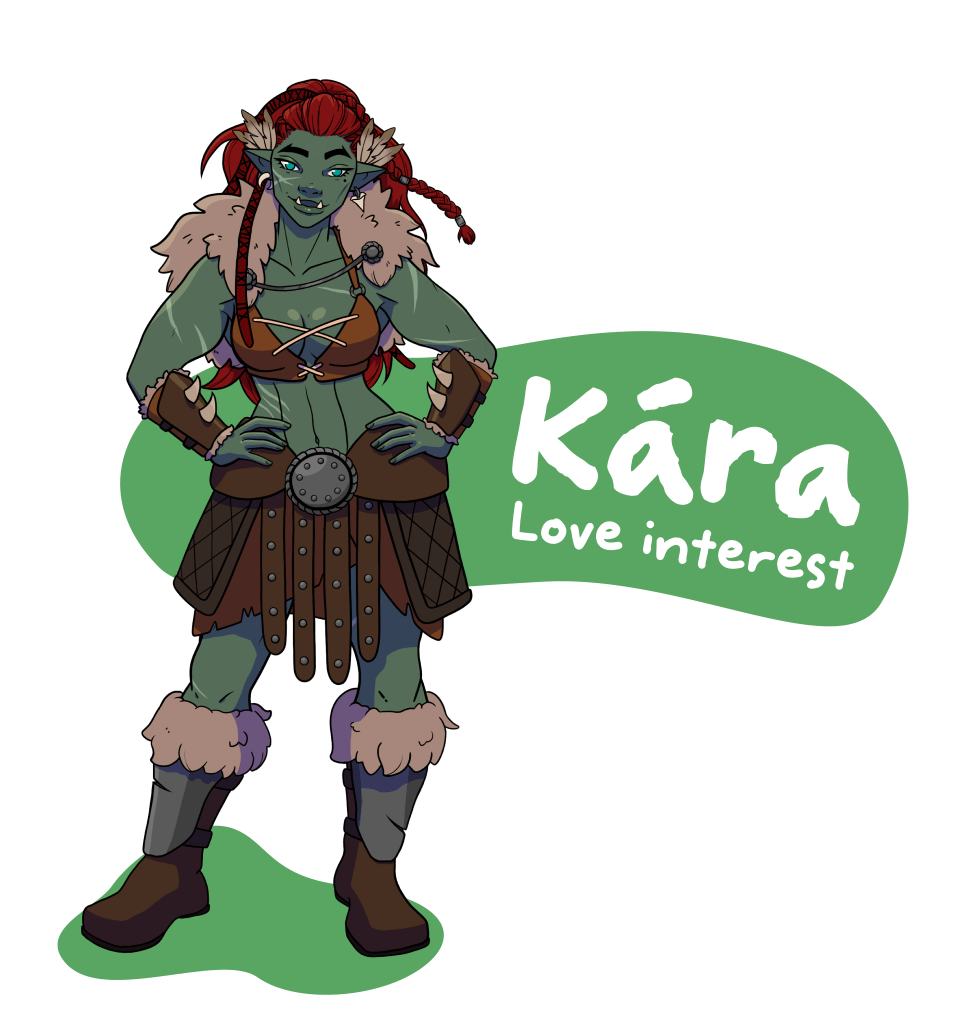
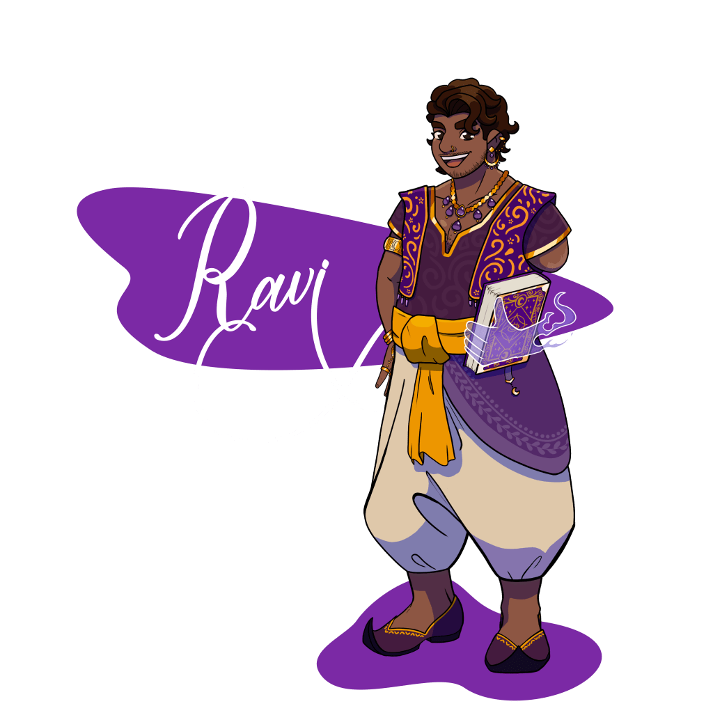
The (quite frankly gorgeous looking) characters are being spotlighted on the game’s website, but the shape language did not quite work out.
Dating & Dragons has a very hand-drawn style in its UI, character designs and typography. The pointy, square boxes did not fit this style.
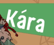
One of the things to look out for in angled lines is that things aligned on them should not accidentially collide with each other at some point (see green and black lines on the image on the right). A large mix of angled lines can also make a deisgn unintentionally busy.
Instead of square boxes, organic shapes would pick up the general style of the game a lot more and might lead to a little more personality for each spotlighted character. Typography that fits to the character might additionally add some flavour.
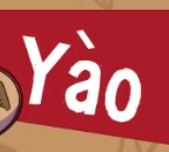
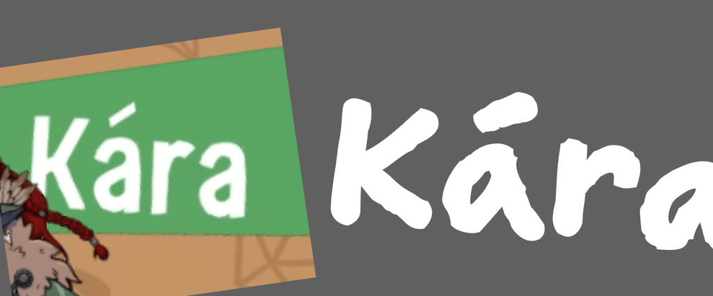
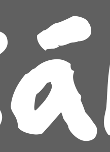
Missing diacritics
Diacritics are special additions to characters. In Germany, we have ä, ö, ü, where the dots are falling into that category. Other languages have different markers, like the shapes above the letter „a“ for Kara or Yao.
Many fonts skip these, leading to unintended results. The system picks a default diacritic to add, which can break the shapes of the typography (here, the letters are rough, but the ´ and ` are smooth), or not center them correctly above specific letters (seen in Yào).
Thank you
A big thank you to the amazing developers over at Twisted Twenty, who allowed me to use this deep dive into parts of their UI as a case study!
If you are interested in getting my expertise for your own project ? Reach out to me!